04
WAYNE GLEN
CASE STUDY
WAYNE GLEN
Neighborbood Branding / EGD
2018-2020
The Brief
Design the branding and signage for a new neighborhood to tell the history of the property while conveying the future,
and fitting the brand into the aesthetic of the area. The new neighborhood would have a strong emphasis
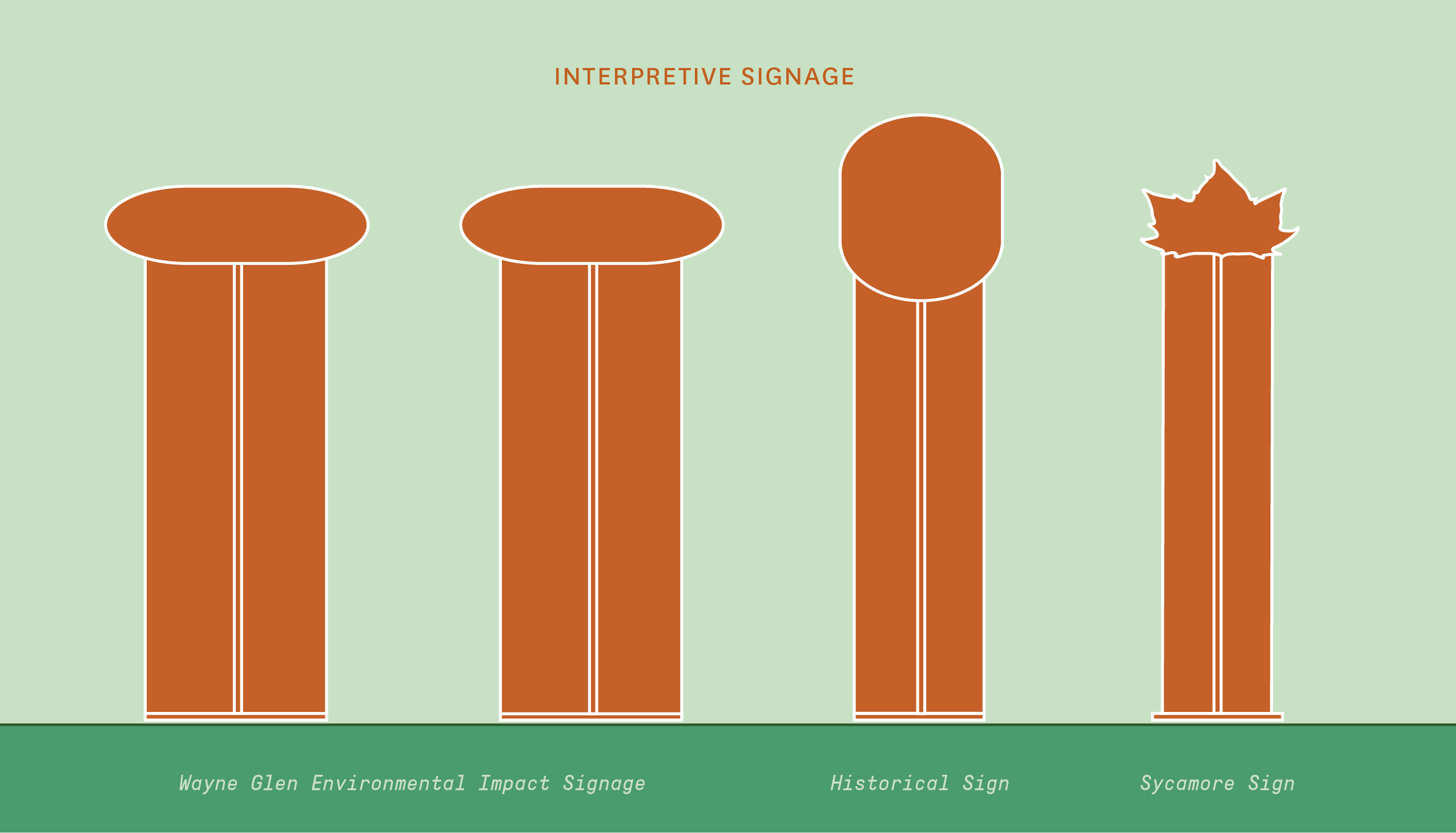
on enviromentalism and stewardship. In addition to the branding, we needed two signs documenting the environmental impacts that were to be made, one historical sign, and one interpretive sign for a 300 year old Sycamore tree that
was being preserved.
Design the branding and signage for a new neighborhood to tell the history of the property while conveying the future, and fitting the brand into the aesthetic of the area. The new neighborhood would have a strong emphasis on enviromentalism and stewardship. In addition to the branding, we needed at least one historical sign, two signs documenting the environmental impacts that were to be made, and one interpretive sign for a 300 year old Maple tree that was being preserved.
Design the branding and signage for a new neighborhood to tell the history of the property while conveying the future,
and fitting the brand into the aesthetic of the area. The new neighborhood would have a strong emphasis on enviromentalism and stewardship. In addition to the branding, we needed at least one historical sign, two signs documenting the environmental impacts that were to be made, and one interpretive sign for a 300 year old Maple tree that was being preserved.
The Story
In 2019, Arcadia Land took on the challenge of transforming the old Walker farmstead, once called Rehoboth, into a new development, now called Wayne Glen, with a significant emphasis on landscape architecture. This was needed to regrade the land by offsetting the flooding and storm water runoff caused by the over-development of the surrounding region. This new neighborhood would be just a little south of Valley Forge National Park, in a region packed with a lot of history. The land itself was settled by a Quaker family (the Walkers) in the early 1700's, not too long after Penn's Grant was established to give the region its name: Pennsylvania. That family held the property, Rehoboth, for ten generations and was one of the founding members of the Valley Friends Meeting across the street from the main property. I was a member of the historic Meeting House myself, so I was introduced to the team to help design the branding and signage for the new neighborhood once the land had been bought by the land developer.
The Process
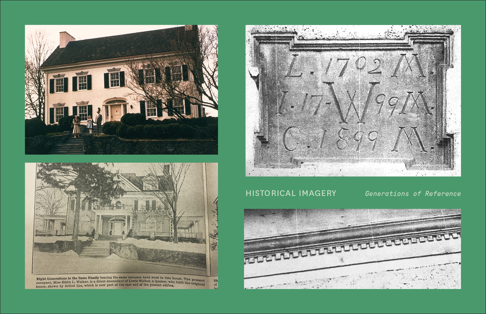
Rehoboth had unfortunately been lost to a fire several decades ago, so the only standing reference to the old home were the remnants of a stone wall that buffered the staircase leading up to it from the road. So after having a few meetings with some of the members of Valley Friends Meeting, including the local historian, I set off for the Friends Historical Library on the campus of Swarthmore College. There I was able to find old newspaper records of the Walker farmstead, and photographs of the house at a more grandiose stage when it had been added onto and modified a few generations after it had been built. This was a helpful reference for the Historical Signage that I needed to make documenting the history of the Walker farmstead. I was also able to find the family marker on the property that recorded the family initials of those who had lived there and done the rennovations. I used this to inform the typography that I'd later use in the branding and for the eventual crest design for the new neighborhood.
The Result
The Result
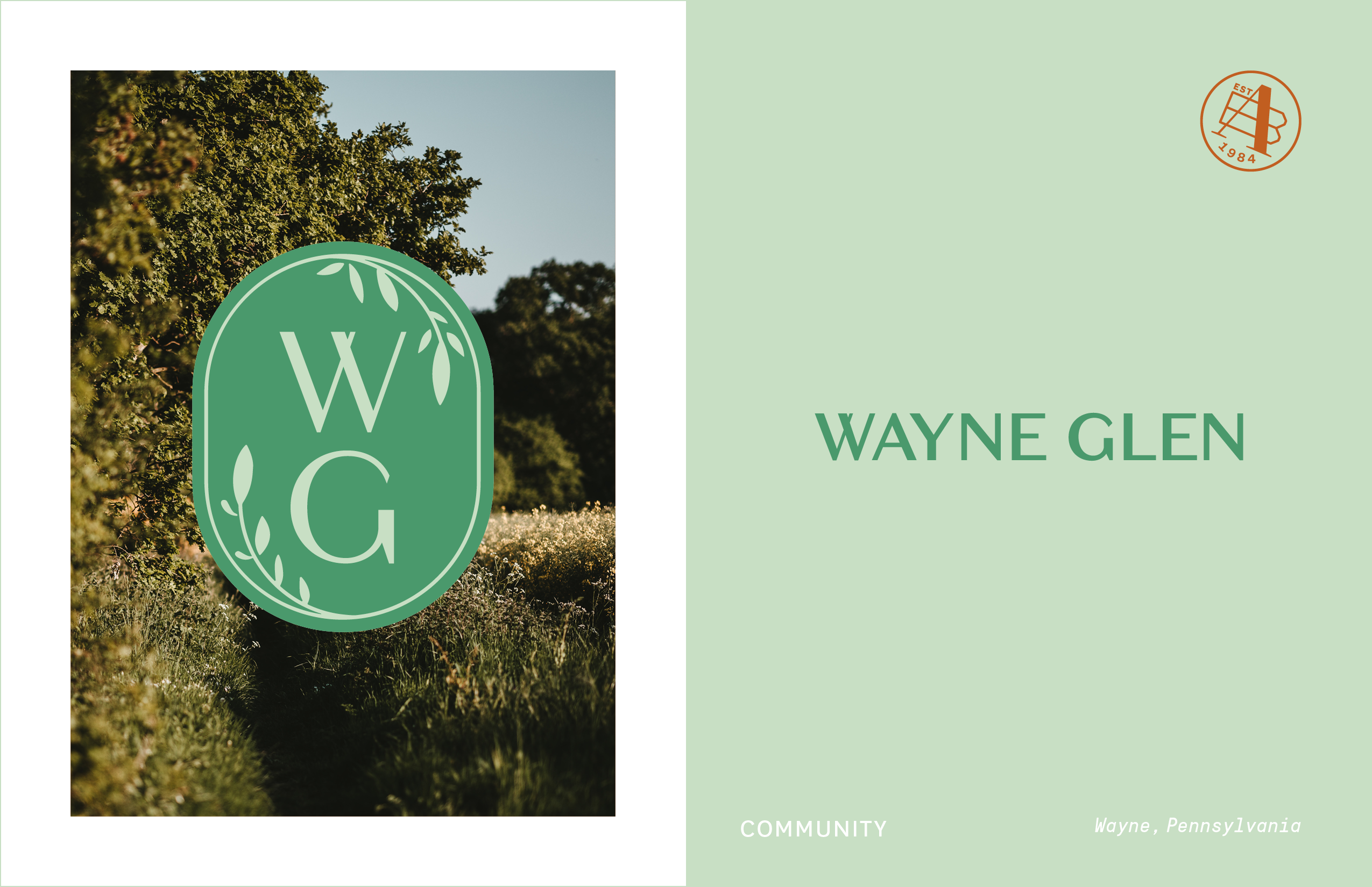
I started with the design of the neighborhood logo which ended up taking the form of a crest, encircled by leaves referencing the state flower of Pennsylvania (the Mountain-laurel). The leaves were a nod to the overgrown nature of the property when we first took a tour. The name of the neighborhood was Wayne Glen, but because the developer wanted it to feel like a hidden gem, the entry monument was errected with the crest design that just bore the initials "WG," which was in part inspired by the family marker on the old property. The primary logo was done
in simple black and white to be evocative of the black painted iron in and around this historic region. We also
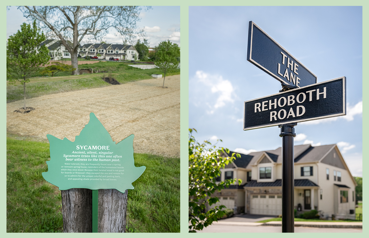
had a small family run business design molded aluminum street signs, in the brand typography,
to match the black and white branding.
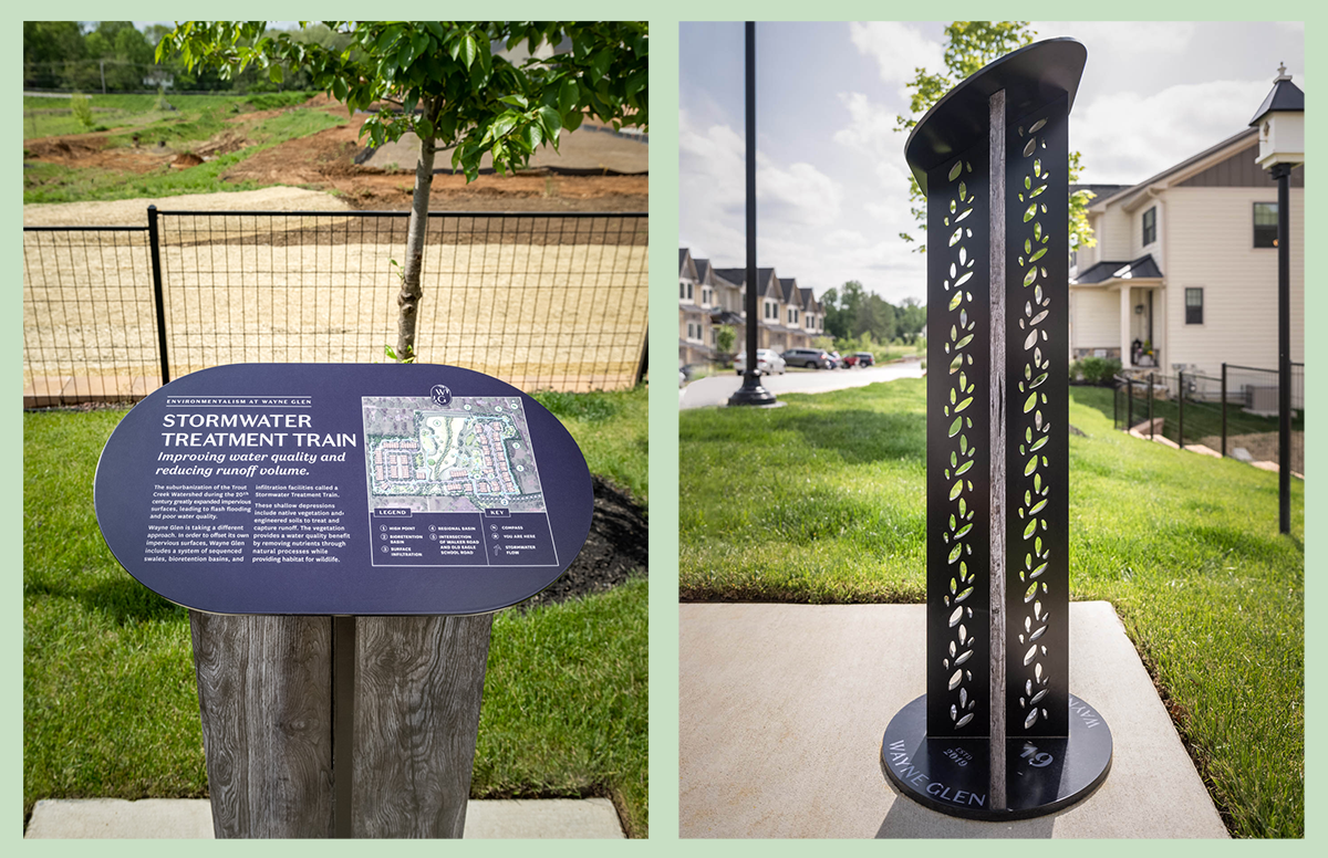
Because we wanted the environmental signage specifically to blend into its surroundings instead of standing out too much, I designed that in a color palette that matched the property greens. I also found a fabricator that used a process called Direct Embed to wrap the front facing metal bases in an image that made them appear to be a gray, weathered-wood look, while having the durability, that wood does not have, to stay standing without needing to be replaced for some time. The profile of the bases were detailed with a cut out pattern of petals and leaves to draw some attention to them as pedestrians approached on the sidewalk.
As the project evolved I also ended up designing custom tote bags and keychains bearing the crest of the neighborhood, and small card that helped welcome new neighbors to the property.
Branding & Environmental Design
Branding Deliverables: Neighborhood Crest, Tote Bags, Keychains / Ephemera
Environmental Design Deliverables: 3 Interpretive Signs, 1 Historical Marker, and Regulatory & Street Signage
I started with the design of the neighborhood logo which ended up taking the form of a crest, encircled by leaves referencing the state flower of Pennsylvania (the Mountain-laurel). The leaves were a nod to the overgrown nature of the property when we first took a tour. The name of the neighborhood was Wayne Glen, but because the developer wanted it to feel like a hidden gem, the entry monument was errected with the crest design that just bore the initials "WG," which was in part inspired by the family marker on the old property. The primary logo was done
in simple black and white to be evocative of the black painted iron in and around this historic region. We also had a small family run business design molded aluminum street signs, in the brand typography, to match the black and white branding.
Because we wanted the environmental signage specifically to blend into its surroundings instead of standing out too much, I designed that in a color palette that matched the property greens. I also found a fabricator that used a process called Direct Embed to wrap the front facing metal bases in an image that made them appear to be a gray, weathered-wood look, while having the durability, that wood does not have, to stay standing without needing to be replaced for some time. The profile of the bases were detailed with a cut out pattern of petals and leaves to draw some attention to them as pedestrians approached on the sidewalk.
As the project evolved I also ended up designing custom tote bags and keychains bearing the crest of the neighborhood, and small card that helped welcome new neighbors to the property.
Branding & Environmental Design
Branding Deliverables: Neighborhood Crest, Tote Bags, Keychains / Ephemera
Environmental Design Deliverables: 3 Interpretive Signs, 1 Historical Marker, and Regulatory & Street Signage
I started with the design of the neighborhood logo which ended up taking the form of a crest, encircled by leaves referencing the state flower of Pennsylvania (the Mountain-laurel). The leaves were a nod to the overgrown nature of the property when we first took a tour. The name of the neighborhood was Wayne Glen, but because the developer wanted it to feel like a hidden gem, the entry monument was errected with the crest design that just bore the initials "WG," which was in part inspired by the family marker on the old property. The primary logo was done in simple black and white to be evocative of the black painted iron in and around this historic region. We also had a small family run business design molded aluminum street signs, in the brand typography, to match the black and white branding.
Because we wanted the environmental signage specifically to blend into its surroundings instead of standing out too much, I designed that in a color palette that matched the property greens. I also found a fabricator that used a process called Direct Embed to wrap the front facing metal bases in an image that made them appear to be a gray, weathered-wood look, while having the durability, that wood does not have, to stay standing without needing to be replaced for some time. The profile of the bases were detailed with a cut out pattern of petals and leaves to draw some attention to
them as pedestrians approached
on the sidewalk.
As the project evolved I also
ended up designing custom tote bags and keychains bearing the crest of the neighborhood, and small card that helped welcome new neighbors
to the property.
Branding & Environmental Design
Branding Deliverables:
Neighborhood Crest, Tote Bags, Keychains/Ephemera
Environmental Design Deliverables:
3 Interpretive Signs,
1 Historical Marker, and
Regulatory & Street Signage

LET'S STAY CONNECTED


